Friday, May 6, 2011

Apple: I'm a Mac Campaign


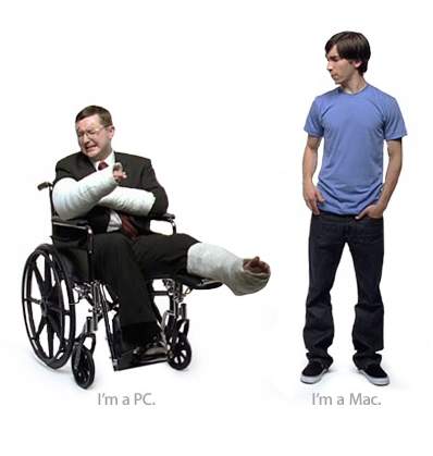
As my final post for the semester, I decided to use an example from the monster of advertising: Apple. I actually would not metaphorically coin Apple's advertising efforts as a monster - more of the Donald Trump of the computer world. Anyways, this ad is part of the "I'm a Mac" campaign, that personified the Apple and Windows computers as real people. The images of the two guys are now instilled in the advertising collective unconscious. The campaign was extremely successful and funny.

Award Winning Viagra Campaign


 After my last post about a viagra print ad, I decided to further investigate how to creatives behind their ad work are able to suggest what they are selling appropriately, and creatively. This particular campaign by Pfizer was extremely successful. It featured middle-aged women falling asleep throughout their day at various locations - at the bus stop, while vacuuming, etc. This particular one is an image of a woman falling asleep while making coffee - standing up.

Viagra Print Ad


I found this ad online after asking some of my friends what there favorite ads are. The image in this ad is not immediately recognized, but upon further investigation, it is really funny and clever. I don't  really think a nail was the best symbol for a penis though - I think the association is painful! However, the graph is too funny to not post in my blog.

Tuesday, May 3, 2011

Horrible Commercial

http://www.metacafe.com/watch/6274474/alisha_lucik_lingerie_football_league_shoots_commercial_in_vegas/

Sometimes rip-offs can be funny if well done, but this is definitely not. The commercial is for I.E.S. financial advisors. It features a horrible actor attempting to play Donald Trump, and featured bikini models. Yuck. It is distasteful and not funny, when attempting to be funny. I really have not including any examples of horrible advertising, so I decided to include one just to show that if you are going to rip-off a commercial, it must be done well.

Hyundai Swedish Commercial


This is so funny. Even though I think it is way too provocative for the United States, this is perfect for the European Union. I chose to include this ad as well to highlight the differences in social acceptability of advertising between the United States and Europe. That is one thing I don't understand - why tastes are so different between the two nations. I would think that the U.S would be more loose towards sexually explicit advertising than the European Union.

Jimmy Fallon's New Ice-Cream: Late Night Snack


Jimmy Fallon announced his new Ben & Jerry's ice-cream flavor on Stephen Colbert's television show. The producers of the show created a video (posted her) with the actual Ben and Jerry. This was great promotional advertising for Fallon. The video was funny and catchy. The so-called "ice-cream" war between Fallon and Colbert simply promoted their products. However, the two comedians are so funny I did not mind watching the obvious advertisements because they were enjoyable.

Samsung Galaxy Ice: Juarez Dance Crew Commercial


This commercial was created for one of Samsung's new phones. I chose to include this in my ad journal because of the way in which it was created. A famous dance crew from Juarez filmed the commercial flash-mob style. The group moved incredibly slowly - so slowly that you cannot tell what the dancers are doing until the entire 18 minute dance is sped up to a 30 second clip - making it look like stop-motion cartoons from the 30's. The effect is incredible! The amount of time that was put into panning this commercial is incredible. The only drawback is that it does not directly market the phone in a direct way. I was way too focused on the process of how the commercial was created than what it was advertising.

Chick-Fil-A Advertising


I know that literally everyone has seen the chick-fil-a cows writing their funny signs, I still wish to highlight how effective this campaign was and still is. In addition, it was crucial to Stan Richard's career and creation of the Richard's Group. Chick-Fil-A was one of Stan's first accounts, and remains at the Richard's Group today. I think the "Eat Mor Chikin" slogan is one of the most recognizable in America. The black and white type mirrors the colors of the cows.

Avera Health: Emergency Plan


What a cool billboard! Even though they may be dangerous, I love interactivity on billboards. They truly make the ad stand out from the countless billboards we see today. The ad is about having an emergency plan when things like car wrecks happen. The smoke that continues to rise from the ad and make it seem alive is from a smoke maker on the back. However, the device was dismantled a few days later after fire marshals were unhappy with the potential dangers. The ad itself is still up and running.

World War Two Bonds Poster


This is a poster from World War Two encouraging citizens to buy war bonds. It's scary! I know that is the purpose of the poster - to incite fear in order to support the government financially, but really? First of all, the poster is sexist - the woman and child are treated like objects that are owned by someone else. Feminists had a cow over this. Secondly, I the hands of the Nazi and Japanese are shaped like the hands of something from a nightmare: they have long scaly fingernails and ominous knuckles. I cannot imagine this flying in today's society. However, it is good documentation of social commentary during that time.

Fage Yogurt: Total Plain Extraordinare


Beautiful art direction! I did not think a commercial about yogurt could be incredibly intriguing, but this one definitely was. The poetry (yes poetry about yogurt!) was well written and flowed freely, taking the commercial in different directions. 3-dimensional forms arose from the yogurt like an avant-garde film. I loved this ad!

Swiffer: Hard to Get


This commercial from Swiffer has been running lately on television. I think it is effective because it displays the qualities of the product in a new way. It's creative content is memorable. The commercial highlights that the mop isn't just for dust, but for mud too. The actresses placed in the mud and dust costumes were excellently cast, and the graphics are strong. In addition, the mud woman is now the perfeect spokesperson for Swiffer. Kudos to the art director for putting this together.

Budweiser Clydesdales: Salute 9/11


I love this commercial. It sends chills down my spine watching it. I chose to include it because of the way Budweiser is able to incorporate their brand with American patriotism. Anytime a brand is able to make force connections to the core values of a country or of a certain people, the campaign will be very strong. I tend to get annoyed with beer commercials, but I can watch this one over and over. This may sound silly, but it's impressive the way these horses are trained to bow!

Gangsters of Paradise and Juicy Fruit


When the visiting alum showed us this ad, I was not entirely thrilled at the quality of the work, even though the idea was great. However, I was inspired by the message he sent to us students that there is no right way or straight direction to get into the work we all dream of. His story of dedication, hard work, and a bit of luck proved to me that my dreams can be met, provided I work as hard as humanly possible to achieve them. I was also intrigued at the dazzling part of his job - shooting video and photographs, meeting celebrities and seeing your work in the public.

Thursday, April 28, 2011

Coca-Cola Christmas Classic


The Coca-Cola Christmas commercials appear in November, year after year. This is one of the earliest types of commercials I remember. I think my favorite is actually the family of polar bears. I chose to highlight this ad because it is a longer version of the 30 second clips. When I see these commercials on television, I feel like Christmas is truly here. They accurately convey the positive feelings of love and cherishing family while promoting a product very successfully. I do love how in this ad, and on the packaging of the glass Coke bottles during Christmas, feature the original illustrations from the 40's of Santa drinking Coke. I hope Coca-Cola continues to create these special holiday commercials.

Progressive Insurance: Flo

Wow this woman is annoying! What a creative marketing ploy. She sticks in my mind like syrup in hair. I have noticed that each main insurance company has a spokesperson or character. Geico has the gecko and the caveman, allstate has the Mayhem Man and Dennis Haybert, and now Progressive has Flo. From what I understand, many of my friends think Flo is funny and the commercials are enjoyable to watch. I don't see the humor, but maybe because they are overplayed.

Geico Caveman Campaign


I have lately noticed how competitive the insurance industry is in regard to advertisements. Unlike clothing or food, each person only has one kind of insurance, so the insurance agencies only have a set base of people.  I've noticed that agencies are trying to target teens and young adults, buying insurance for the first time. This is the main audience now in insurance sales. Adults are more than likely set in their ways with their insurance providers, so agencies also offer large rewards for switching providers.

Allstate Mayhem Man


The relatively new Allstate campaign featuring the Mayhem Man is so funny. Each commercial features a man who metaphorically stands for all of the scenarios that could happen resulting in damage to your vehicle. The man never cracks a smile, and is as dry as West Texas, which makes it even more funny when he pretends to be a "hot babe jogging" like in the commercial I posted above. This is actually my favorite of all the ads. I think this campaign appeals to a younger audience through humor. I know that the last Allstate commercial campaign was solely about trust and responsibility and savings. Adding humor to the commercials allows Allstate to compete with the younger insurance agencies like Geico and Progressive.

Wednesday, April 27, 2011

U.S. World War II Propaganda Poster


I love the war posters from World War Two. I love the classic feel and tend to repeat it in my work. The slogans used though are kind of scary. I understand there was paranoia about spies, but a lot of these posters go too far. This is an example of one that I think is really insensitive. I plan to post others that I find truly funny, or serious. The advertising effort during the war was incredible.

Canon Rebates

I love rebates. Well, sometimes. Rebates are a clever way for companies to offer a discount that requires additional steps to redeem. When buyers of products with rebates forget to send for the rebate, the company bags that money. However, for those scrupulous consumers who carefully watch their money, rebates are a good opportunity to score a great deal. Sometimes thought, the price of the product is marked up, so a rebate just levels the price. I think the best way to determine if a rebate is a good deal is to check the price of the product in at least three different places to see if the deal is in fact, a deal.

Doritos Super Bowl Contest

In this blog, I wanted to highlight the effectiveness of promotional contests. This year, Doritos created a contest in which the winner would have the ad they created as the main commercial for Doritos, and win a large sum of money. The prize is incredible - this year the award winnings totaled one million for the first place finisher, 600,000 for the second place, and so-on. This contest was extremely effective because it featured an incredible prize and audience involvement: the public was allowed to vote on several rounds of which commercials were the best. In addition, the contest was entertaining. The commercials were funny. The creativity involved was enormous. And the publicity for Doritos was insurmountable.

Wednesday, April 20, 2011

Magazine Spread: Taylor Guitars

This spread for Taylor-made guitars is  terrific. I love the typography that looks like old parts to a letter press, and the repetition of texture in the guitar and on the facing page. The color scheme of warm browns and french grays really create contrast, when the idea of those two colors together does not sound attractive. Of course, the word play is clever and makes you read it twice.

NBA Finals Poster

What terrifc art direction! The dual meaning of the copy along with the image of basketball greats lined up in secession according to era is really great. The ad is so simple and effective. This is the type of design work I aspire to do when I graduate. Or even better, while still in school. Bernach really had a strong influence over me regarding how a simple and strong message is best. I want to do that kind of advertising.

Genghis Khan Print Ad

"Ruthless Warrior with Really Cool Facial Hair" reads the main part of the copy in this ad. It's funny because the launguage in the first half of the sentence is austere and sophisticated, while the second half of the sentence is relaxed and comical. And, on top of that, thinking og Genghis Khan in a funny way is even more hilarious. Good work.

1923: Listerine

The copy on this ad for Listerine reads "Often a bridesmaid but never a bride." This ad is funny but sad at the same time. I think it probably hurt many an unmarried woman's confidence, and probably caused a huge increase in sales. Simple, yet effective. It uses the fear of an embarrassment and unhappy ending to entice the viewer to buy listerine, whether they truly need it or not.

Columbia Magazine Ad

This ad is hilarious! Copy is so important in advertising, just as much as the image. A strong, clean, and simple ad is often more effective than an ad that is too busy. This is a magazine spot for Columbia designs by Goodby and Silverstein. I would love to work there one day as a designer!

When a brand becomes a part of pop-culture...

While browsing at Urban Outfitters the other day, I saw a plethora of t-shirts for sale that were advertising something. No, the store was not giving them away as promotional gifts, people were actually spending almost 30 dollars on each shirt. This t-shirt, pictured above, sold at Urban Outfitters, demonstrates the transition from a brand to a part of pop-culture. When this happens, the brand has literally got it made.
I think that in American culture, brands and products sadly play a significant role in shaping us and our lives. I know I grew up eating cornflakes and hearing Tony the Tiger say "They'rrrrre Grrreat!" during Saturday morning cartoons.

Wednesday, April 13, 2011

Target In-Store Signage


As a former employee of Target, I was and still am intrigued by the in-store advertising Target does. Their design team is actually in-house, which is impressive considering how innovative their campaigns tend to be. The signage that hangs from the ceiling points customers in the right direction of the seasonal items. I absolutely love Target's design aesthetic. In addition, the commercials and newspaper inserts feature the same illustrations. Target's advertising strategy well-planned and directed.

Iphone Application Advertisements

A new advertising medium is iphone applications - the advertisements that pop -up while using the app, such as after playing a word on words with friends, generally pay for app itself. Generally, a no-ad version of the app is available, but the user must pay for it, or pay more that the app with ads. I really like the approach designers used with this new medium - the user can decide whether or not they want to pay for the app, or have advertisers pay for it in order to use the user as an audience. It also shows the user why advertisers is everywhere - because it pays for mass media.

Office Max and JibJab: Elf Yourself

http://sendables.jibjab.com/

Have you ever "Elfed Yourself?" This funny interactive advertisement sponsored by Office Max and created through JibJab allows users to upload photos of themselves and whoever else to a program that puts faces on elf bodies, who then dance to several different songs. The application is hilarious and great fun during the holidays. The interface allows users to send the dance or post to social media sites. Due to the success of the original, JibJab offers themed danced based on other holidays and pop-culture.

Another Entry from the Original Journal...

Doritos "House Sitting" Super Bowl Ad


This spot for Doritos was hilarious. I originally wrote this post as a journal entry - so I'll let the netry do the talking.

Dayquil "Man Cold" Commercial


This post is originally from my ad journal. I included a video of the commercial from YouTube.

Teleflora Super Bowl Spot


The Teleflora Super Bowl Spot "Tell Her How You Feel" featuring Faith Hill was humorous and unexpected. It featured a man hung up about what to write in a card for his significant other. Faith advises the man to just tell her how he feels, and he writes down a comment about her body. Some women have called the ad offensive, but it's comical and truthful. I have included the image from the book as well as the clip from YouTube.

Tuesday, April 12, 2011

Wow...


This online advertisement completely surprised me. I do not even know which company sponsors it. It was a pop-up ad, so I took a screen shot and edited out the background. The dual meaning of "slam-dunk" really surprised me. After I got over the shock-value, I found it humorous and memorable. I already emailed it to a few friends. This ad is effective because of it's humor and shock value.

UNT Scoreboard

This is an image of the UNT scoreboard at the old stadium. As you can see, Wells Fargo, Powerade, Coca-Cola, and Coors Light advertisements are larger that the score boxes. Although I understand that these powerful sponsors play a huge part in funding athletic and scholarship programs, I think it sends a negative message to attendees that the advertisers are more important than the team. It also raises an ethical issue of whether it's appropriate for alcoholic beverages to support college campuses. I understand that beer is a part of the experience of tailgating, but alcohol is not allowed inside the stadium. Underage drinking is a big issue on college campuses as well.

Magnets


Looking at the side of my parent's fridge, I saw a magnet that had the entire Dallas Cowboys schedule, along with NCAA schedule for Texas Tech, UT, and A&M. The magnet was also had insurance information for their local agency. I have always seen these schedules on my parent's fridge, but never thought about the actual advertisement until this class. Although this is not a new form of advertising, it is extremely effective. Every time the schedule is checked, the reader generally sees the agency information. The photo I took with my phone was fuzzy, so I found this example online, offered through Graphic Specialties Inc. It looks just like the one I saw.

Advertising on DART Bus


Does anyone else thing this is a tad distracting? At least with billboards, the driver is looking up and ahead. With advertisements on the sides of buses, like this one I saw in Dallas in the arts district, the driver of another vehicle must turn to the side and avert their eyes from the road. I know in New York, advertisements cover everything, but I still view it as a creeping problem.

Audi's Super Bowl Spot: Release the Hounds

The Super Bowl Spot Audi did was hilarious. It featured two men trying to escape from a prison full of wealthy people. Once they escape a slew of comical obstacles, one man jumps in a BMW and the other jumps into an Audi. It turns out that the decision was a trap - the BMW returned the prisoner back to the prison, while the man in the Audi escaped. The commercial stereotyped rich men and pushed the idea that what is well-established is not always best. It also made BMW look outdated, which is a rather impressive feat.

New Camel Packaging


I saw the new packaging for Camel Cigarettes while in line at 7-11. I had never much attention to the tobacco stores behind the counter, but this actually caught my eye. Before I harp on Camel, I must first say the package is incredibly well-designed, and definitely hits its' target audience: females between the ages of (honestly probably 16-24) 18-24. Now, I get to say good job Camel at making smoking seem "cool" again.

UNT Billboard


This was a tricky shot to take driving down 35! (I actually had a friend take it). Anyways, I see these ads for UNT all the time. I think they are effective because UNT is not well known in comparison with other major schools in Texas like UT-Austin, A&M, and Texas Tech, even though more students attend UNT than Texas Tech or A&M. The billboard campaign UNT uses focuses on a simple statistic for each board. Another one says the number of UNT graduates working in DFW. These statistics allow the viewer to understand for themselves the impact UNT has on the community and its accreditation as a major university, instead of filling a  billboard with fluff and and an attractive set of ethnically correct students. Good job UNT!

Coca-Cola Documents Changes

This ad tagged my interest because of the dual meaning behind it. Initially, the ad celebrates the 50th anniversary of Coca-Cola. However, it is also celebrating the gradual loosening of moral codes for women, obviously including forms of dress. I'm not going to go on a feminist rant about how demeaning the image is. I think it is an interesting piece of social commentary.

Obama Print Campaign for 2008 Election


This ad was featured in major magazines during Obama's 2008 campaign. I was extremely impressed with the design team for his election. Generally, political campaigns feature horrible design and artwork. It seems as though the designers are afraid to step out of the raucous red white and blue starry-themed ads with huge pictures of the candidates face. Let's face it politicians, all your ads look the same. However, this ad is different. The copy reads, "Black, Raised by a single mom, and named Obama... You better have a lot of hope." How original! How different! The copy speaks to everyone, and it says Obama is on eof us, who has struggled against diversity and has been successful against it. Of course, everyone wants a president with these qualities. In addition, the colors are muted and Obama's image is very small.

Ad Spots on Facebook Page

I took a screen shot of the ad sidebar now featured on Facebook. I think the ad bar is a great way for Facebook to gain revenue without being to intrusive to the user. The ads are small and do not float or make noise. The ads are incredibly effective because Facebook inputs the user's likes and interest into an algorithm which chooses the ads most similar to the page. For instance, my interests include design, art, and volleyball, so a lot of my ads consist of art schools, design websites, and volleyball gear. Although this is great for Facebook, I tend to click on these sites and find things I don't need. It's just another way for companies to get buyers to  part with their money.

Monday, January 24, 2011

Original Post:


This post is originally from the ad book I started to create before transferring to the web. I did illustrations for the book. This one is for a recent Luv's Diapers commercial that left me rather appalled. The commercial is really lacks taste. I do not understand the decisions that led to the making of this commercial. I am also attaching the clip as well - it is definitely worth watching.